Editorial 02
Admiral Catering
A collection of ads created to build and grow Admiral Catering's brand, from weddings and special events to corporate lunches. With a limited budget and no access to professional photo or video content, the creative focused on making a consistent, polished, and approachable brand using the resources we had.
01
Project Overview
Admiral Catering was a little different from some of the other brands I worked with because there was so much more room to figure out what the brand could become.
They were not starting completely from scratch, but their visual identity and advertising style were still being developed. Translation: we had a lot of creative freedom to experiment with how Admiral should look, feel, and speak.
At the same time, the budget was somewhat limited. We did not always have access to professional photo or video content, which meant the creative had to do more of the work.
The challenge became figuring out how to make the brand feel intentional, polished, and recognizable using the resources we actually had.
02
Building the Brand as We Went
Because Admiral did not already have a truly strict visual system in place, each piece of content became part of defining what the brand could look like moving forward.
I wanted the work to feel warm, approachable, celebratory, and polished without making it feel too formal or too luxurious. That balance was especially important because Admiral needed to work for several different occasions.
A wedding ad should feel different from a corporate lunch ad, but both should still feel like they came from the same brand.
I had to think less about creating one exact look and more about creating a visual language that could stretch.
03
Working With What We Had
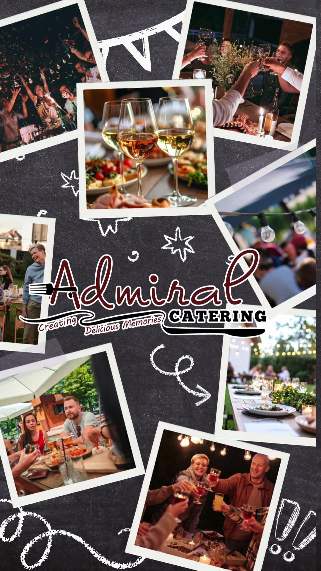
One of the biggest limitations was the lack of original photo and video content.
Because of that, I had to be much more selective with the imagery we used, and actually relied more heavily on typography, color, composition, and messaging to keep everything connected.
Stock imagery had to feel believable and warm without looking too staged.
It had to feel like Admiral without actually being Admiral.
 0:13
04
Different Audiences. One Brand.
While it was a larger challenge, I really liked working with and discovering the vast range of services Admiral offered.
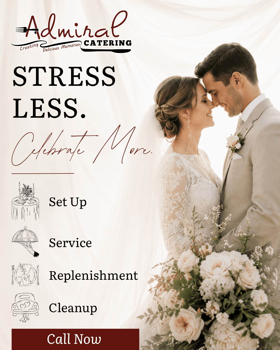
Weddings & Events
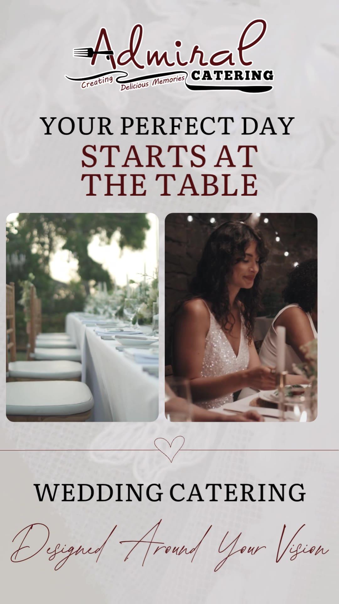
The wedding content could feel softer and more emotional. A lot of the messaging focused on making the day easier and allowing people to enjoy the event instead of worrying about the details.
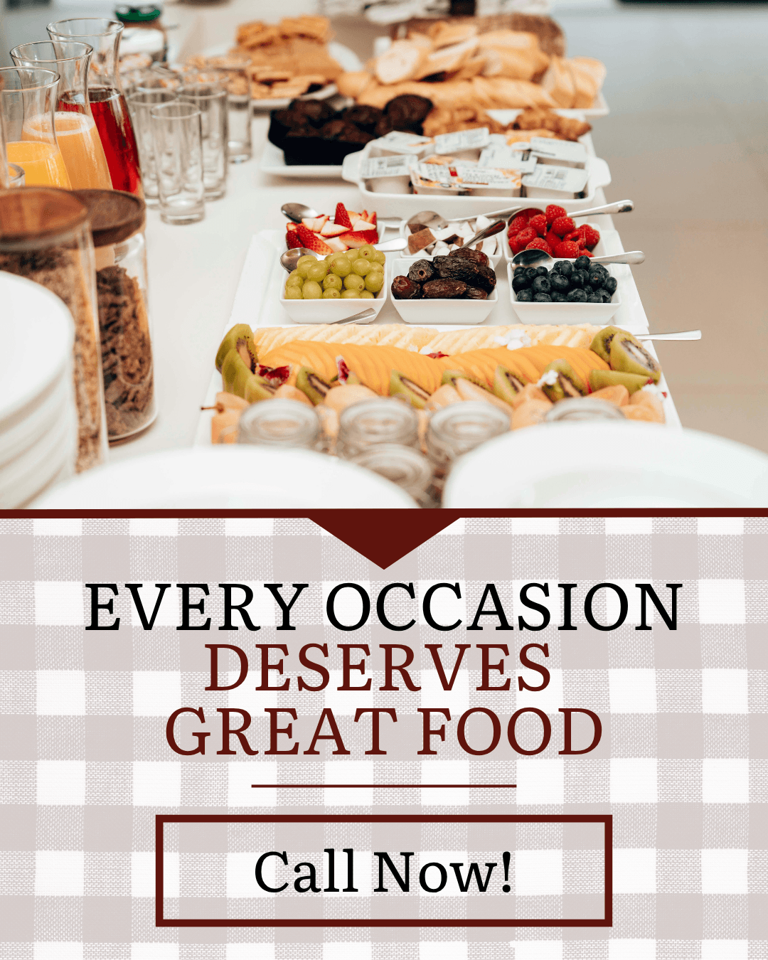
Evergreen Catering
The broader catering content focused more on the food itself; the idea that good food can make almost any gathering feel better.
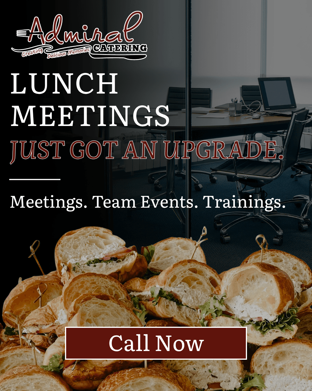
Corporate Catering
Corporate content needed to feel more straightforward and practical, but I still wanted it to have personality. The goal here was to make meetings, trainings, and team events feel a little less ordinary.
05
Designing Across Formats
This project also gave me the chance to think about how the same brand should work across very different formats.
Paid Social
Social ads gave us more space to use imagery, messaging, and layout to build a stronger idea around the occasion.
 0:14
Display Ads
Display ads were more limited, so the message had to be simpler and the hierarchy had to work quickly. There was no room for anything unnecessary.
OTT
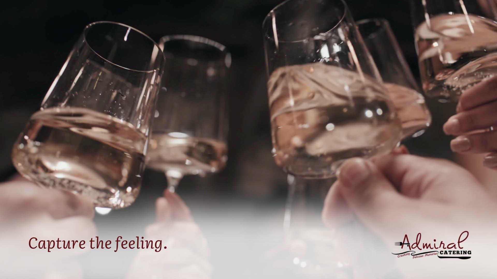
OTT gave us more time to build a feeling. Even without custom video, the pacing, imagery, and copy could still work together to tell a story.
The format changed, but the brand still needed to feel consistent.
 0:29
06
Creative Freedom With a Purpose
Having a lot of creative freedom was exciting, but it also meant there were fewer rules already in place.
That made every decision feel more important as each one helped define what Admiral could become.
I found myself thinking about questions like:
- What should Admiral feel like?
- How polished should the imagery be?
- How different should wedding content feel from corporate content?
- What can stay consistent even when the audience changes?
Those questions helped keep the work from feeling random, even when the campaigns were very different.
07
The Bigger Picture
Admiral reminded me that not every brand starts with a complete visual system, sometimes, the brand develops through the work itself.
- A social ad helps define one piece.
- A display campaign helps define another.
- A video helps establish the tone.
And over time, those decisions start to build something recognizable.
08
What This Project Reinforced for Me
This project reinforced a big fact: how important smaller decisions become when the resources are limited.
When you do not have custom photography, large productions, or a really established brand system to rely on, things like typography, image choice, messaging, and layout matter even more.
Admiral gave me a lot of room to experiment, but it also made me think more carefully about what each piece was adding to the brand.
That is what made the project so interesting to me. We were not just creating ads for Admiral, we were helping shape what Admiral could look like.