Editorial 03
Finding Our Way
A series of Amazon A+ modules designed to communicate the value of a book on shared pedagogy, while visually reflecting the journey it takes the reader on.
01
Project Overview
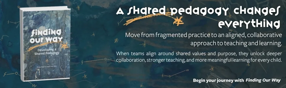
Finding Our Way by Fiona Zinn and Anne Van Dam is centered around the idea of shared pedagogy; helping educators move from fragmented ideas and practices toward something more aligned and collaborative.
When editor Erin Casey came to Branding Iron Management, the goal was to create a series of Amazon A+ modules that would help explain the book while still feeling connected to the world the authors had already created.
My biggest challenge: making sure the modules did more than just explain what the book was about. Erin Casey wanted them to reflect how the reader is supposed to feel while moving through it.
02
Understanding Before Designing
Before I started thinking about layouts, fonts, or graphics, I needed to understand the progression behind the book.
Finding Our Way starts in a place that feels more scattered. There are different ideas, different perspectives, and not necessarily one clear path forward. As the book continues, reflection, dialogue, and shared meaning begin to pull those pieces together.
That became the foundation for the visual direction.
Instead of treating each Amazon module as its own separate piece, I wanted the full set to feel connected. Even before someone reads every word, I wanted them to feel a subconscious shift from something more fragmented and uncertain into something clearer and more organized.
03
From Scattered to Connected
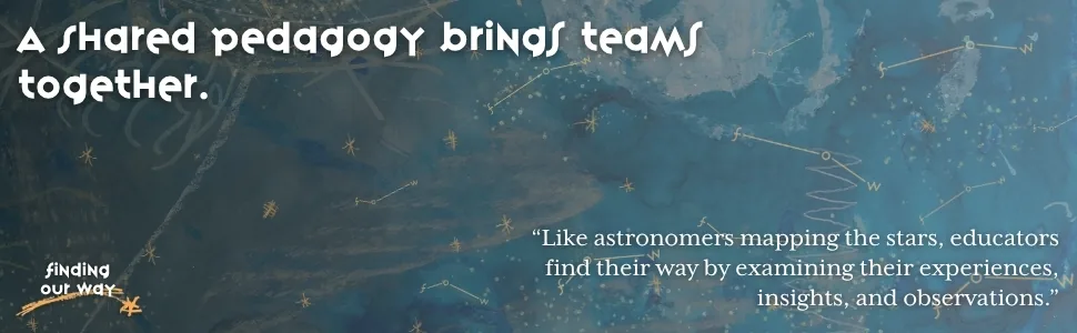
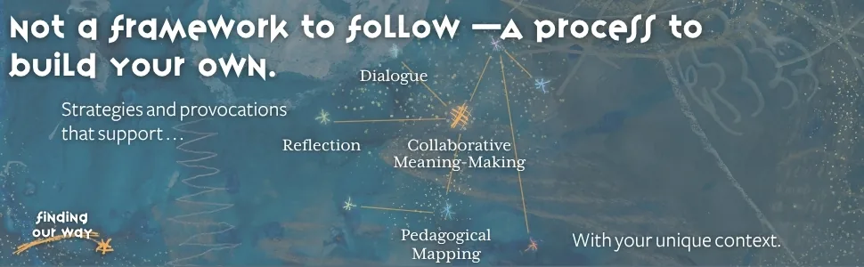
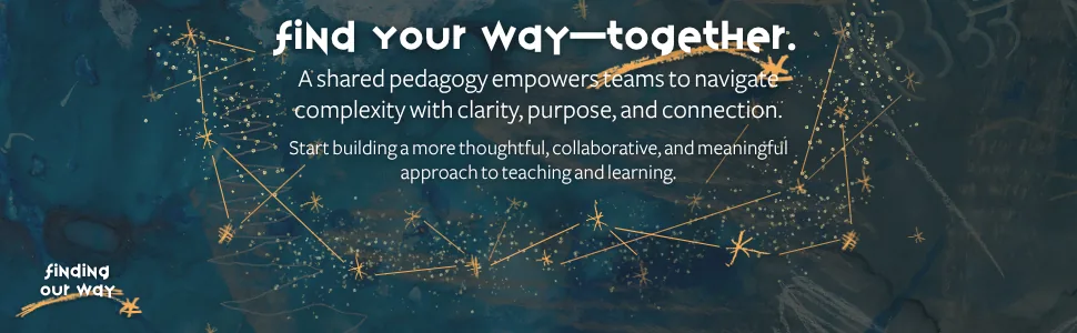
The constellation became the main visual metaphor for that shift.
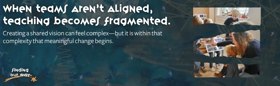
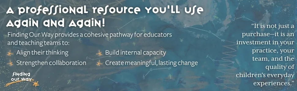
At the beginning, the background is darker and the stars, lines, and marks feel more scattered. However, as the modules progress, those elements slowly start to connect. The backgrounds become lighter, the compositions feel more organized, constellations begin to take shape, and the feeling of relief is palpable.
By the end, what started out feeling disconnected has become something much more complete.
That mirrors one of the biggest ideas behind the book: shared understanding is not something a team just starts with. It is something they build together.
04
Building the Visual Language
Color
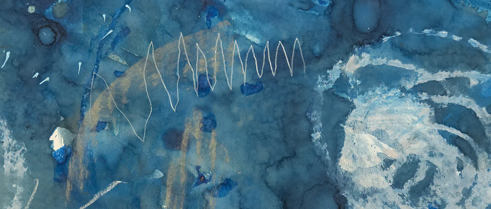
The modules gradually move from darker teal tones into lighter blues. I wanted that shift to help the full set feel like one continuous journey instead of eight separate graphics.

Constellations
The scattered stars and lines slowly become more organized as the sequence continues. This reflects the idea of individual experiences and perspectives coming together to form a shared pedagogy. Just like the ideas within the book itself.

Texture
I wanted the backgrounds to feel layered and imperfect rather than overly clean or institutional. The texture helped keep everything feeling more human and connected to the tone of the book.
Typography
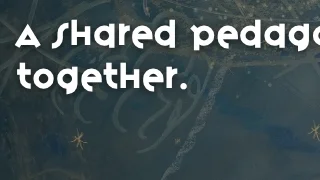
The fonts were chosen to balance personality and readability. The headline font gives the modules a more recognizable voice, while the supporting type keeps the information clear and easy to follow.
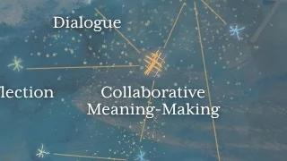
Illustration & Marks
The hand-drawn lines, stars, arrows, and diagrams were all selected to feel exploratory. It almost feels like someone is actively mapping out ideas and making connections as they go.
05
Designing the Sequence
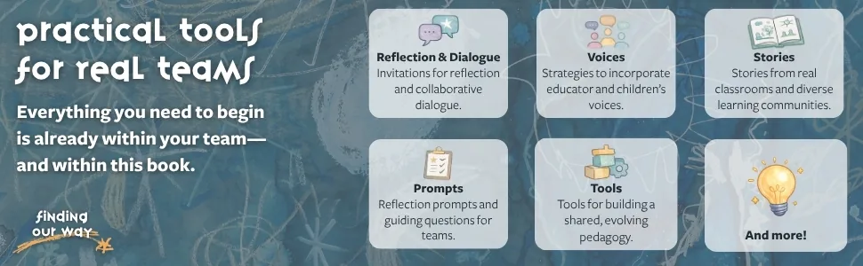
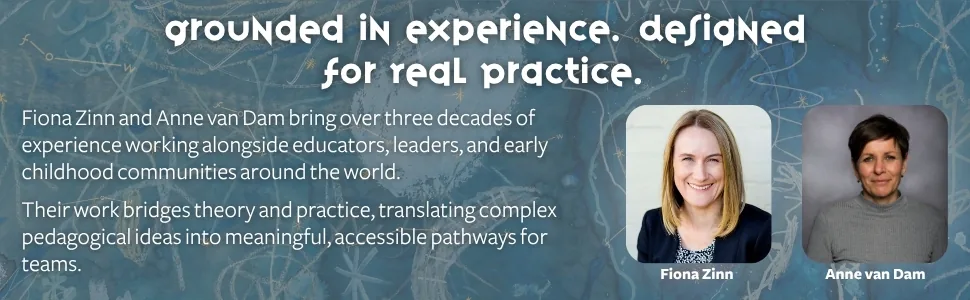
Each module still needed to work on its own, but together they were meant to guide the viewer through a clear progression:
- Introduce the book and its main idea
- Show the problem of fragmented teaching and a lack of shared alignment
- Introduce shared pedagogy as the shift
- Explain what makes the book different
- Show what readers will find inside
- Communicate its practical value
- Introduce the authors and their experience
- End with a clear invitation to begin
As the message becomes clearer, the visual world does too.
06
The Finished System
The final set uses progression as part of the storytelling.
Across all eight modules, the color, composition, illustrations, and hierarchy gradually move the viewer from something more fragmented into something that feels more connected.
Each module communicates one part of the book, but together they tell the larger story of Finding Our Way.
07
What This Project Reinforced for Me
This project reinforced something I already believed about branding: understanding the subject changes the work.
The constellations, color shift, typography, textures, and even the order of the modules only worked because they were tied back to what the book was actually trying to communicate.
Without that understanding, they would have just been design choices. With it, they became part of the story.